Kitchen Living Room

Friday, September 30, 2011

Making Peace with Paint

I've decided to embrace the act of picking out wall paint colors and try to enjoy it. As I've written previously, paint colors stress me out JUST A TAD. But I think if I can learn to have fun with it, renovating this condo will be a much more rewarding experience.

And I only have one more room to paint. Hey, I never said all of my goals were challenging.

The last room left to paint is the kitchen. My only guidelines for picking out a color is that it's got to flow well with the purple living room (haha) and be conducive to brightening up the space, since it's not exactly a spacious kitchen by any stretch of the imagination. No, my kitchen is cute. My initial thought was a pale yellow, but my boyfriend is convinced it will wash away into the all white backsplash. I want to say, we want to change the backsplash anyway, and who cares? But instead of actually saying that I will explore some color options through the wonderful inspiration that the Internet provides.


Pale yellow looks nice. I already have a paint sample in a color similar to this - Cornerstone by Behr. (Described by someone on the internet as 'pale cream with a bit of yellow.') Here's a picture of Behr's cornerstone in someone's entryway:


Hmm. In order to emulate the kitchen above, I might have to go with a bit richer yellow than Cornerstone.


This deeper yellow could also work.


I am loving this super pale blue, but I'm afraid it will look too much like our bathroom. The bathroom is an entire living room/hallway away though, so maybe it would work?


Here's an example of how pale-on-pale or white-on-white can look great, and not washed out at all (in my opinion).

I think my favorite color so far are the shades of yellow...we shall see! Right now the kitchen is already yellow, but it's a more mustardy variety. Here's a picture of the kitchen right now:

Notice the lovely new cup pulls! I just think that yellow is tooooooo yellow. Know what I mean?

Thursday, September 29, 2011

Kitchen Upgrades Under $25 Part 1

Sometimes the most fun upgrades are the ones that are cheap. Ok, scrap that. ALL of my favorite upgrades are the cheap ones (see my dining room light upgrade here). Today I've got part one in a two part series of under $25 kitchen upgrades to show you.

I've always loved kitchens with dark hardware (oil rubbed bronze) and light hardware alike (think satin nickel). But I figured the light-and-airy look I was searching for in my kitchen would be better served by sticking with the satin nickel hardware that was already there. When I bought the condo, my drawers and cabinets had the same tiny satin nickel knob hardware that is very common in kitchens. Here's a picture from one of my pre-purchase visits:


Notice the identical hardware on the drawers and cabinets. I have always admired kitchens with white cabinets (lucky me since my cabinets are already white!) and drawers with cup pulls. Here are some kitchens I love:


In order to attempt to emulate those looks, I bought three packs of these satin nickel cup pulls from Target. They look a lot better in person. At $6.99/ea they cost me a total of $20.97 plus tax. (You can also buy a six pack for $19.99 online here, but they did not have the value pack at my local Target store.) The brand on these cup pulls is Target Home. The quality is good, but not perfect. As you know if you've ever shopped for hardware, it is expensive. So these guys are good-looking and they will do the trick, but yours might have a few light scratches like mine did. I don't really care though, because it was difficult for me to find the right size cup pull for my teeny-tiny drawers at an affordable price. The cheapest cup pulls I found were about $4.99/ea and they weren't the right size. At $3.49/ea, I knew the Target cup pulls were the winners!


The most difficult part of installing the new drawer handles was measuring. Grrr. I had to go from one hole to two, so I drilled on either side of the old hole and left it the old hole since the cup pull will cover it up anyway. I would recommend making a paper pattern of the back of the cup pull and maybe even taping it over the front of the drawer to help show you where to make the holes. I did not have to remove the drawers in order to drill the new holes which saved a lot of time.

Mmm, love those nice gray laminate countertops. HAHA. Anyway. So here we are before our lovely cup pulls are installed...


And after! (Not to mention I cleaned the counters. That in itself probably made a bigger difference.)


I am happy with how they turned out. They're just the right size (not too big since the original hardware was quite small comparatively) and they work well. Oh, and if you're wondering why I didn't show you the other side of the kitchen, that's because there aren't any drawers over there, and cup pulls look really weird on cabinets.

Now the kitchen just needs paint, a new backsplash, new countertops, a deeper sink, a new faucet...

Next time I'll show you my other kitchen upgrade under $25!

Wednesday, September 28, 2011

Painting Public Service Announcement

Dear Fellow Painters,

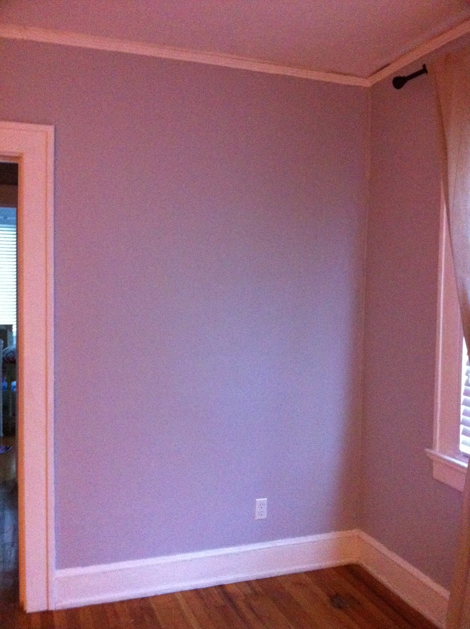
If you enjoy perusing the world of home decor blogs as much as I do, you may have noticed a recent trend towards gray walls. The lovely neutral color has shown up in kitchens, living spaces, bedrooms, and even elegant bathrooms. If you decide to jump on this trend wagon, I can only applaud your good taste, and attempt to send you fair warning: shades of gray are just that. They are shady and varied and endlessly confusing. When you stand helplessly in front of the hundreds of colored chips in the home improvement store, battling the urge to scream and/or cry, pay careful attention to the undertone of the gray shades. Are you looking at a gray that is going to be blue in low light? Or maybe green or -- gasp -- purple?

Well, friends, I picked a lovely shade of lavender. Violet is nice of course, maybe for some, but I DO NOT WANT. However thanks to an extremely misleading Behr advert, I now have an entire living room and hallway of pure purple. Sure, it's totally gray in the exact perfect lighting, but most of the time? Most of the time it's freaking purple.

The color is Manhattan Mist and I would like to suggest that perhaps a new era of the paint chip be born. Perhaps one in which the paint color designers make mention of the underlying color on the chip. Just an idea, BEHR. One that you might implement before I lose my mind or commit domestic violence.

Just in case you might dare to think I'm crazy, other people (see: Factinis and Factomelettes and this The Nest thread) have had this same purple nurple experience and somehow lived to blog about it. And I have pictures.

Manhattan Mist...looking suspiciously GRAY

That is purple, not gray. Purple.

Now please excuse me while I attempt to embrace my purple walls or perfect the art of walking around without my glasses. Whichever happens first.

Sincerely,

Color Victim

Tuesday, September 27, 2011

$25 Dining Room Light Upgrade

Take a peek at my dining room (ceiling):


Hooray for 1980s light fixtures! (Full disclosure: I have no idea if this light fixture is from the 1980s. A Google search for '1980s ceiling light' yielded a lot of neon.) Anyway, I'm only kidding. I hate this light fixture (sorry, light fixture).

Of course, being the girl with expensive tastes that I am, I trolled the internet for (inappropriately priced) inspiration.  Here is a little Jonathan Adler number for a measly $600:


Robert Abbey Jonathan Adler Meurice Pendant in Polished Nickel

And a much more affordable Laura Ashley piece ringing in at $200:

Laura Ashley Cooper Pendant Kit


Although that guy is referred to as a 'pendant' so who the heck knows what size it is.

Soooo, to give my poor credit card a break (and to lower my chances of being electrocuted) with a quick and cheap and not-so-dirty fix, I purchased this Barrel lamp shade in Cream (size large) for $25 at Target.


I've admired it ever since I helped my boyfriend's mom pick it out along with this surveyor light base (currently sold out online) for her condo:


Well, in the interest of not leaving out any juicy detail, first I bought a lamp shade similar to this one (but without the squiggly embroidery) from Target on clearance for $10.39. However, it was a few inches too small and wouldn't fit over what was left of the light fixture after I removed the original large flat chrome and white (chrome on the top, white on the bottom) metal 'lamp shade.' About $15 later and I arrived at the correct size.

My first step in this process was to remove the original metal lamp shade, which just involved a few turns of some bolts with my hand and a bit of help from a wrench. This is what was leftover:


After that, my next step was to simply attach the new lamp shade with picture hanging wire (mine was silver and it is simply very easily bended/thin wire in a large coil that you unravel).


I wrapped the wire around the metal frame inside of the lamp shade (check out a lamp shade to see what I'm talking about) and then looped the same wire through the holes leftover from where I removed the bolts on the old metal lamp shade. Then I adjusted and readjusted about 500 times. Stand on the table. Adjust. Climb off the table. Look. Turn the light on and off. Look again. Repeat.

So here's the big reveal! Again, 1980s:


And, TA-DA! 2011!


A brand new light that completely changes the look of the dining area for $25 and about 1/2 hour of effort (not including buying the wrong size lamp shade at first!). My take-away from this project is that transformations do not have to be expensive or a struggle. Sometimes you can totally work with what ya got! When I first did a walk through of the condo, I immediately thought, "Oh man, gotta replace it." So, give your Stuff a second look and you might find that there's hope for it yet.

Next time on 650 square feet, I will be discussing the circle of hell that is devoted to choosing paint colors.

Friday, September 23, 2011

Red Box vs. Red Envelope

This month two movies I am super excited to see are on Red Box:

Something Borrowed
Jane Eyre

I stopped using Netflix because I could never remember to watch the movies I received in the mail, let alone return them! So I would end up receiving maybe two Netflix movies a month and watching only one of them. Bummer! With Red Box I can pick up a movie whenever I really feel like watching one and take it back when I am running errands anyway. This saves me money because my Netflix account was around $10/mo, and renting a movie with Red Box is only $1/movie. I watch far fewer than 10 movies a month anyway. You can even pick a kiosk near you and reserve a movie online, then go and pick it up within the same day.

Please note that I was not asked to write this review, nor did I receive any compensation. I just like Red Box. But, if you do use the links above to visit Red Box and decide to rent a movie or game, I will receive one free rental. Yay!

Living Room Mood Board

Since the living room will soon be painted (whenever I find time) and have a brand new window installed (Saturday morning!), I decided to create a mood board to help with the decoration process. I like brushed nickel in bathrooms and kitchens, but I believe that living rooms are the perfect place to utilize the warmth and darkness of oil-rubbed bronze.


The total cost for this room is as follows:
  • Behr Manhattan Mist paint from Home Depot - $20 (might need another gallon, in that case tack on another $25 dollars for a gallon without the rebate special that was running during Labor Day weekend)
  • Target pharmacy lamp - already own $0
  • Target candle by Missoni - gifted $0
  • Oriental rug - gifted $0
  • Velvet tufted chair - $270
  • Drapery rod - $30 (might be able to use one I already have)
  • Curtains - $40 for two
  • Coffee table - $250
  • Couch - gifted $0
  • Pillows - $96 for three
For a grand total of $706. I created the same room with a dark coffee table to show the difference:

living room with oriental rug & dark coffee table

Hmmm! I can't decide which I like more.

Thursday, September 22, 2011

Happy 27th!

My brother turned 27 years old yesterday. Today we went to pick out his birthday present:

Salomon Men's XT WINGS 2 Trail Runner


He picked out these trail running shoes because they are comfortable and known to last a long time.

Yesterday, on his actual birthday, we bouldered for a bit at the gym. Later we all went out to a local Mexican restaurant, then we took a short road trip to see some of his friends that were hanging out. 

Yay for brothers!