If you enjoy perusing the world of home decor blogs as much as I do, you may have noticed a recent trend towards gray walls. The lovely neutral color has shown up in kitchens, living spaces, bedrooms, and even elegant bathrooms. If you decide to jump on this trend wagon, I can only applaud your good taste, and attempt to send you fair warning: shades of gray are just that. They are shady and varied and endlessly confusing. When you stand helplessly in front of the hundreds of colored chips in the home improvement store, battling the urge to scream and/or cry, pay careful attention to the undertone of the gray shades. Are you looking at a gray that is going to be blue in low light? Or maybe green or -- gasp -- purple?
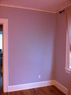
Well, friends, I picked a lovely shade of lavender. Violet is nice of course, maybe for some, but I DO NOT WANT. However thanks to an extremely misleading Behr advert, I now have an entire living room and hallway of pure purple. Sure, it's totally gray in the exact perfect lighting, but most of the time? Most of the time it's freaking purple.
The color is Manhattan Mist and I would like to suggest that perhaps a new era of the paint chip be born. Perhaps one in which the paint color designers make mention of the underlying color on the chip. Just an idea, BEHR. One that you might implement before I lose my mind or commit domestic violence.
Just in case you might dare to think I'm crazy, other people (see: Factinis and Factomelettes and this The Nest thread) have had this same purple nurple experience and somehow lived to blog about it. And I have pictures.
 |
| Manhattan Mist...looking suspiciously GRAY |
 |
| That is purple, not gray. Purple. |
Now please excuse me while I attempt to embrace my purple walls or perfect the art of walking around without my glasses. Whichever happens first.
Sincerely,
Color Victim


No comments:
Post a Comment